User part
Help user to select the business
1.Task
For users, when users are faced with a large amount of business data, the problem often faced is that it is difficult to intuitively compare and select the business they are satisfied with. So, we want to build visualization tools to help users. It can intuitively understand the differences between different stores, and can choose the store that suits them according to its location and preferences. It can also analyze the text data of reviews to help users extract valid information from reviews.
Therefore, we decided to compare the differences of "restaurants" in all categories through 4 interactive maps to help users choose the restaurant they want to go to.
2.Rough selection
For a user to select a ideal restaurants, location is one of most important factor. So we decide to use a map show all restaurants’ location first. We use the visualization tool Plotly, which support zoom in and zoom out. And it also support to use “lasso select” to select a range on map. And we can get a subset of all candidate restaurants.
Secondly, we want to show the restaurant we extract from the review text. Because it is high dimensional data, we used parallel coordinates to visualize it. Each line in the graph is a specific restaurant. And each axis is an attribute.User can select a range on each axis, to filter some important attributes he thinks. After this process, the user can get still do more filter until leave 2 or 3 restaurants. Then we can do a detail compare.
3.Detail comparison
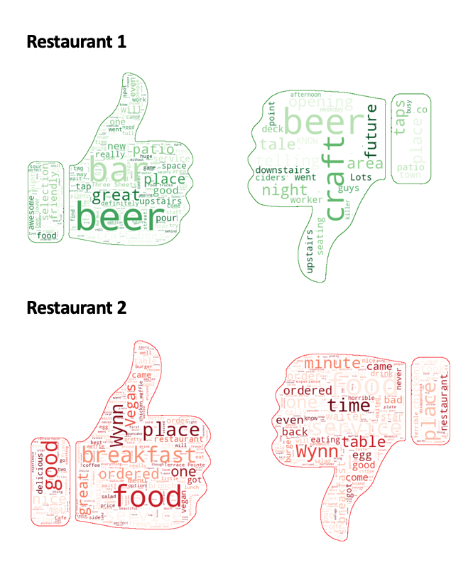
After checking a user preference by rough selection step, the user can compare details through two visualization graph, one is wordcloud to display positive and negative text from review comment, and another is a radar chart to compare 7 topics of the selected restaurants. Word cloud displays how frequently words appear in reviews of each restaurant, by making the size of each word proportional to its frequency. In this project, we provide two word cloud, which are positive and negative, to visualize more useful information for the user’s decision. To implement this, we classify the review and text with their sentimental value as positive sentiment and negative sentiment by python TextBlob sentiment method. A radar chart is useful to compare multiple quantitative variables, especially the datasets scored high or low. Additionally, the user can see which variables have similar values or if there are any outliers amongst each variable, such as taste, stars, and feeling.
In figure, we use two colors (green and red) to represent each restaurant for word cloud and radar chart identically to make the user perceive each restaurants results easily. To visualize the difference between the positive and negative reviews, we use contrast images by thumbs-up representing positive and thumbs-down representing negative. Furthermore, the radar chart is interactive graph in HTML, it shows detail scores of the variables if clicked.
In this figure, a user find two restaurants considering taste food with the criteria (taste > 4.5, food > 4.5, and stars > 4.0). Firstly, the user can get text information about menu and feeling which other visitors left in wordcloud. Then, the user can compare the detail scores of other topics which the user doesn’t consider important.